project
overview
SUMMARY
The Beacon Yoga website redesign offers students a more simple and seamless way to sign up for classes with the schedule on the same website instead of a 3rd party website, a user-friendly interface that is easy and clear to navigate, complete with colors that inspire and empower, and provides a visual example of what the studio offers with the use of current photographs.
PROJECT SCOPE
Project Type: Website Re-design
Platform: Desktop + Mobile
Deliverables: User Research, User Testing, Wireframes, Prototypes
Tools: Pen & Paper, Google forms, Zoom, Adobe Illustrator, Figma

MY ROLE
User Research
UX Design
Branding
THE PROBLEM
Current Beacon Yoga students are looking for a more streamlined way to sign up for classes through the website and new students need more visual information to encourage them to sign up for a class.
THE SOLUTION
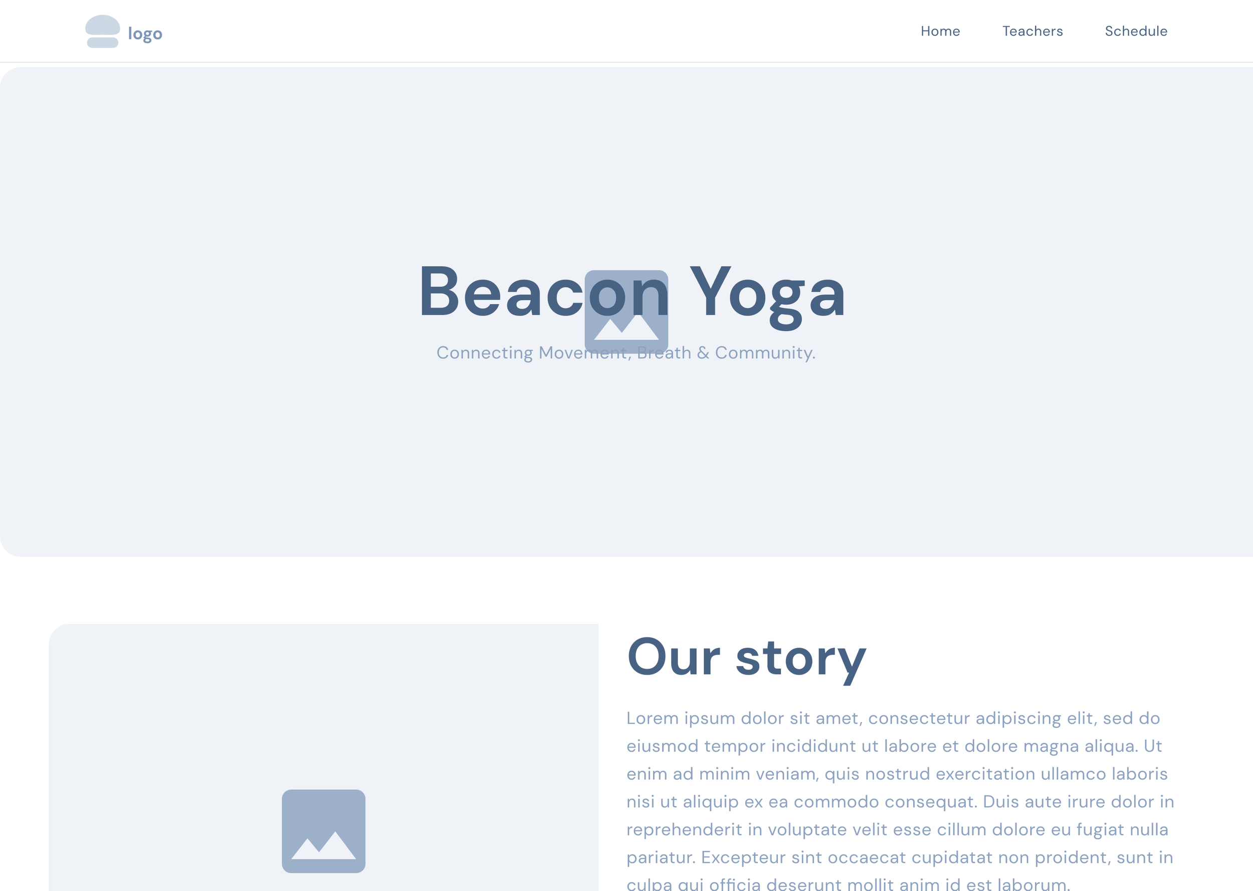
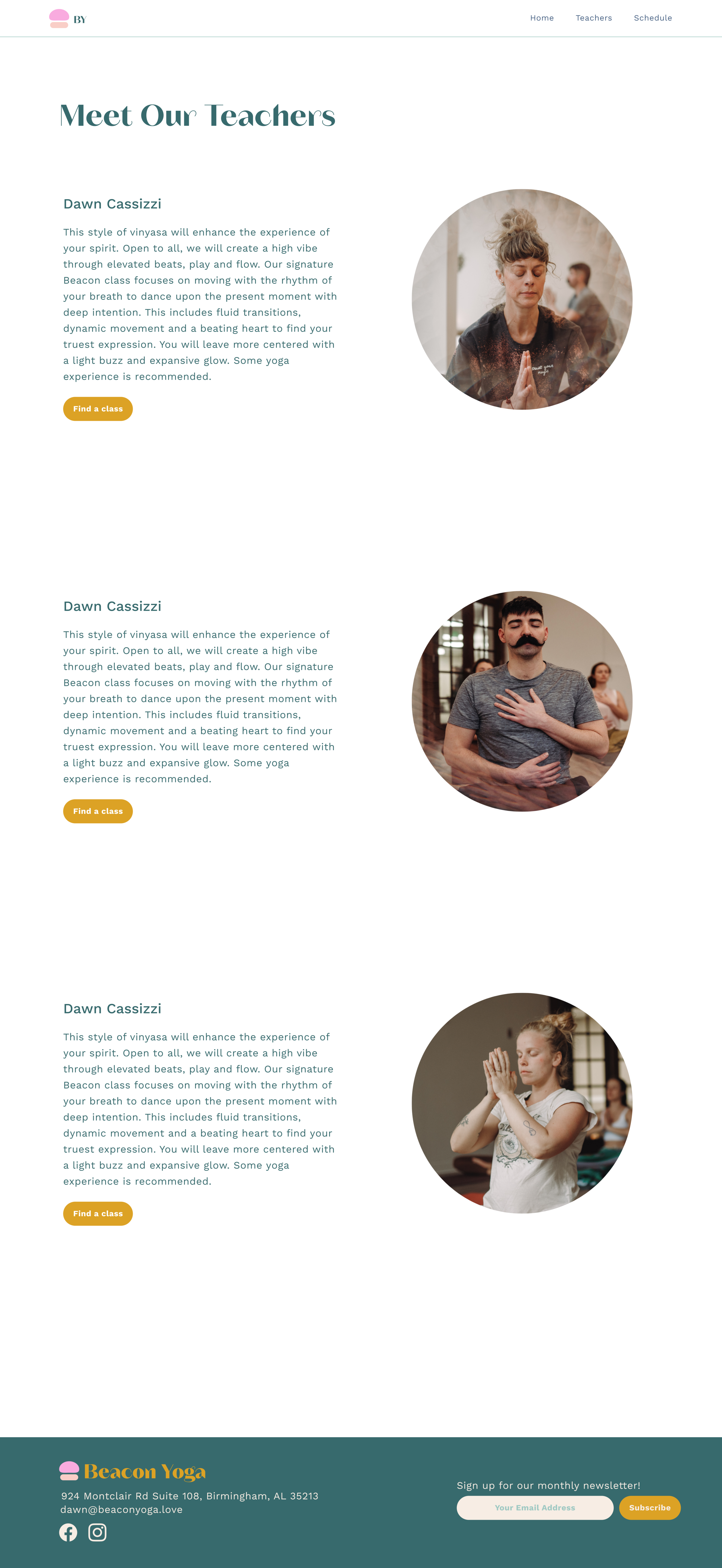
The website re-design features a simple navigation bar, current photographs of the studio and has the class schedule on the business website instead of a only on the 3rd party website.
USER RESEARCH
Create and send out a survey
List and review competitors
Analyze research
Summarize takeaways
Determine user pain points
Determine user goals
user RESEARCH
Competition Analysis
Google Forms Survey
User Personas
Empathy Maps
User Flows
DELIVERABLES
Main takeaways:
100% of Beacon Yoga students sign up online before the class instead of at the studio
75% of Beacon Yoga students access the website through a mobile phone browser, leaving just %25 accessing through a desktop browser
Users clarified that they would like to see more photos of the studio on the website
SURVEY RESULTS


These days, yoga is everywhere, so I realized how important it was for my client’s branding and vision to be unique and represent the business. Together, we narrowed down three main goals:
CLIENT’S VISION + GOALS
Visibility & Awareness
User friendly interface
+ easy to sign up for classesAesthetically pleasing rebrand that empowers students and the business
Asking questions through the “how might we” method helped me reframe my insights into opportunities and innovate on problems found during the meeting with the client and through the user research.
DEFINING THE PROBLEM
Visibility & Awareness
How might we bring visibility & awareness to the Beacon Yoga brand and website interface?
User-friendly & Inspires Sign-ups
How might we create an interface that is user friendly and encourages users to sign up for classes?
Aesthetically Pleasing
& Empowering
How might we design so that students and users are empowered by Beacon Yoga’s brand and website?
user personas

This user persona represents students who are ages 20-29, they are busy working multiple jobs or juggling school and work, but are motivated and eager to practice yoga for general health reasons but also to meet new friends. Since they are always on the go and on their phones, they prefer to sign up through their mobile browser on their phones. They are frustrated when the sign up process is too long.

This user persona represents students who are ages 30-49, they are settled into their day jobs and have sought out yoga as a way to decompress, relieve stress and improve their health. They are nervous about signing up for in-person classes, but are very curious. They rely on what they see and read online, therefore need more information and visuals from the Beacon Yoga website to push them to decide on signing up and arriving with confidence.
EMPATHY MAPS + STORYBOARD
Creating empathy maps and a storyboard helped me to relate to the users even further.


WIREFRAMES AND PROTOTYPES
Sketches + lo-fi wireframes
I translated my user flows and research into sketches and low-fidelity wireframes in Figma. The process resulted in and informed multiple iterations of the flow and design.


HI-FIDELITY WIREFRAMES


conculsions
OUTCOME
Seamless way to sign up for classes with the schedule on the same website instead of a 3rd party website
User-friendly interface that is easy and clear to navigate
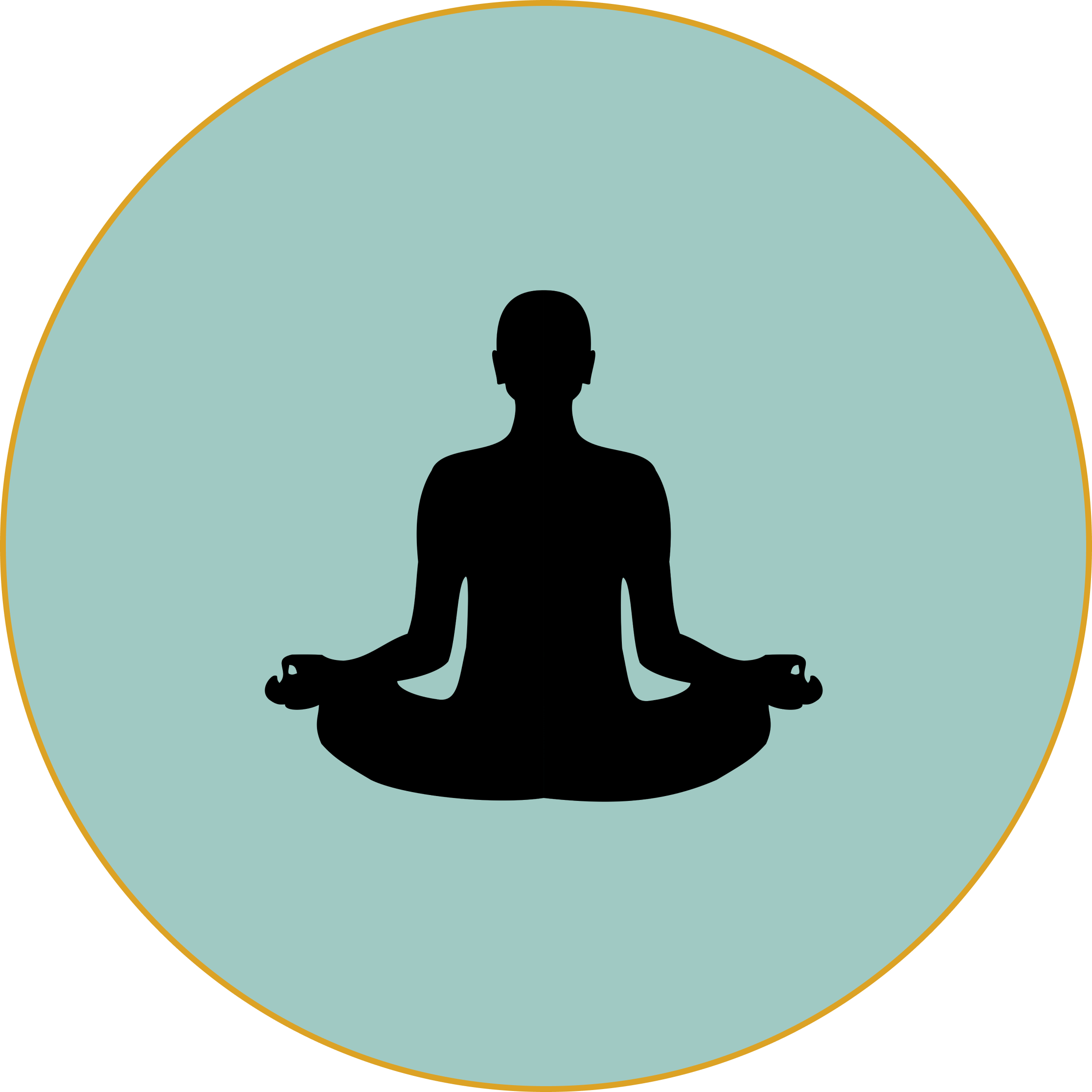
Colors that inspire and empower students
Provides a visual example of what the studio offers with the use of current photographs
SOLUTIONS
Improved interface that represents the business
and their brandData and research informed design choices
Implementing data for final design and launch

